miscellaneous projects
csw accounting
The CSW Accounting logo is designed to communicate professionalism, trust, and financial growth through a clean and modern visual identity. The use of a refined serif typeface paired with a deep blue color palette establishes credibility and stability, while the gold accent introduces a sense of success and upward momentum. The flowing line transitions into a bar chart element, subtly reinforcing the idea of financial progress and analytics. By balancing simplicity with symbolic meaning, the logo creates a strong, memorable brand presence suitable for a professional accounting firm.
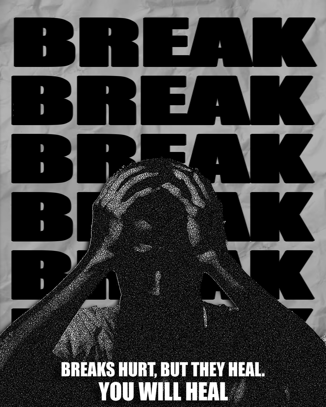
break poster
The “Break” poster explores themes of emotional struggle and recovery through bold typography and high-contrast imagery. The repeated use of the word “BREAK” creates visual intensity and reflects the overwhelming nature of hardship, while the central figure reinforces a sense of vulnerability and internal conflict. The monochromatic palette emphasizes mood and raw emotion, allowing the message to remain the focal point. Paired with the closing statement, the design shifts from tension to reassurance, communicating that while breaking points are painful, they are also part of the healing process.
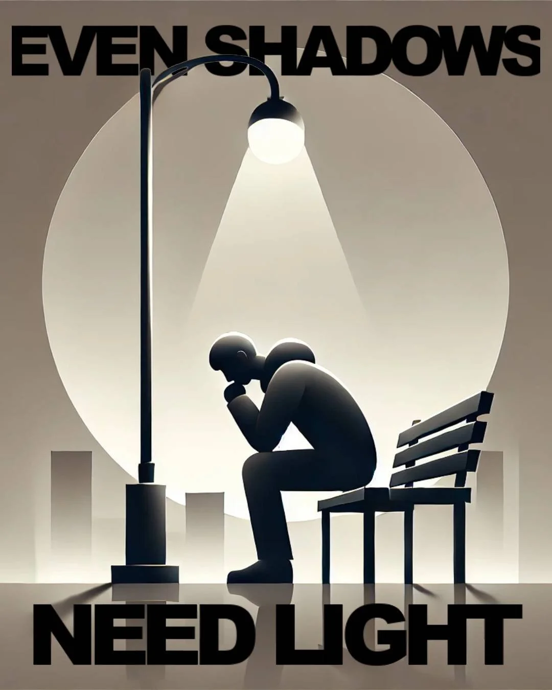
inspirational poster
This poster uses minimalism and lighting to communicate a message of hope and introspection. The solitary figure beneath a streetlamp creates a quiet, contemplative scene, symbolizing isolation while the light represents guidance and resilience. The large circular glow frames the subject, drawing attention to the contrast between darkness and illumination. Bold typography anchors the message, reinforcing the idea that even in the darkest moments, there is always a source of light. The simplicity of the composition allows the emotional weight of the message to resonate clearly.
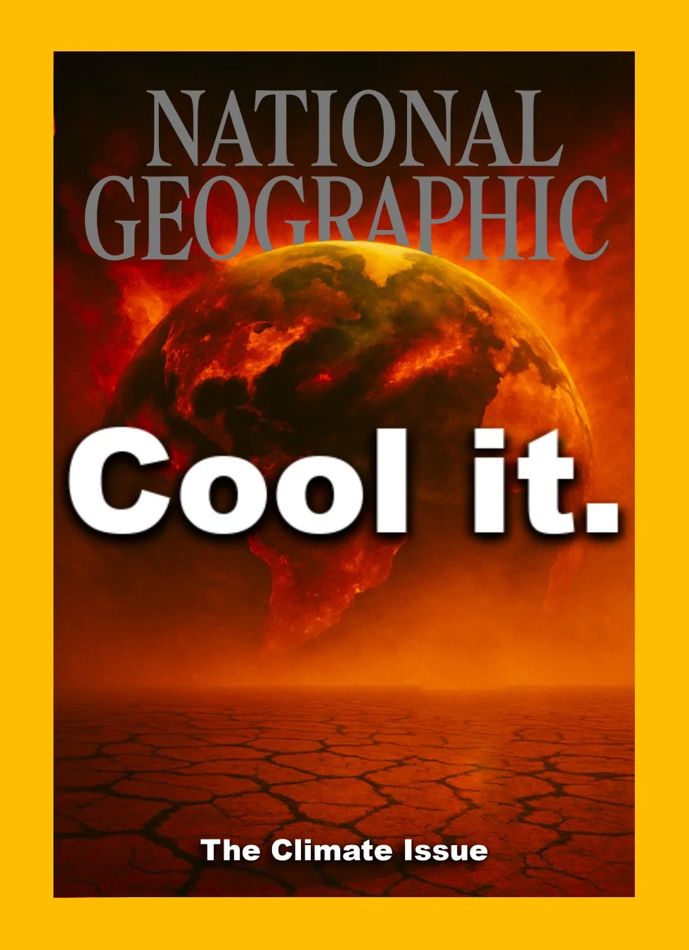
national geographic cover redesign
This redesign of a National Geographic cover focuses on the urgency of climate change through dramatic imagery and bold messaging. The iconic yellow border is preserved to maintain brand recognition, while the burning Earth and cracked landscape create a powerful visual metaphor for environmental crisis. The headline “Cool it.” delivers a direct and impactful call to action, contrasting with the detailed imagery to emphasize clarity and urgency. By combining familiar branding with a striking, modern visual approach, the design reinforces the importance of the issue while remaining true to the publication’s identity.
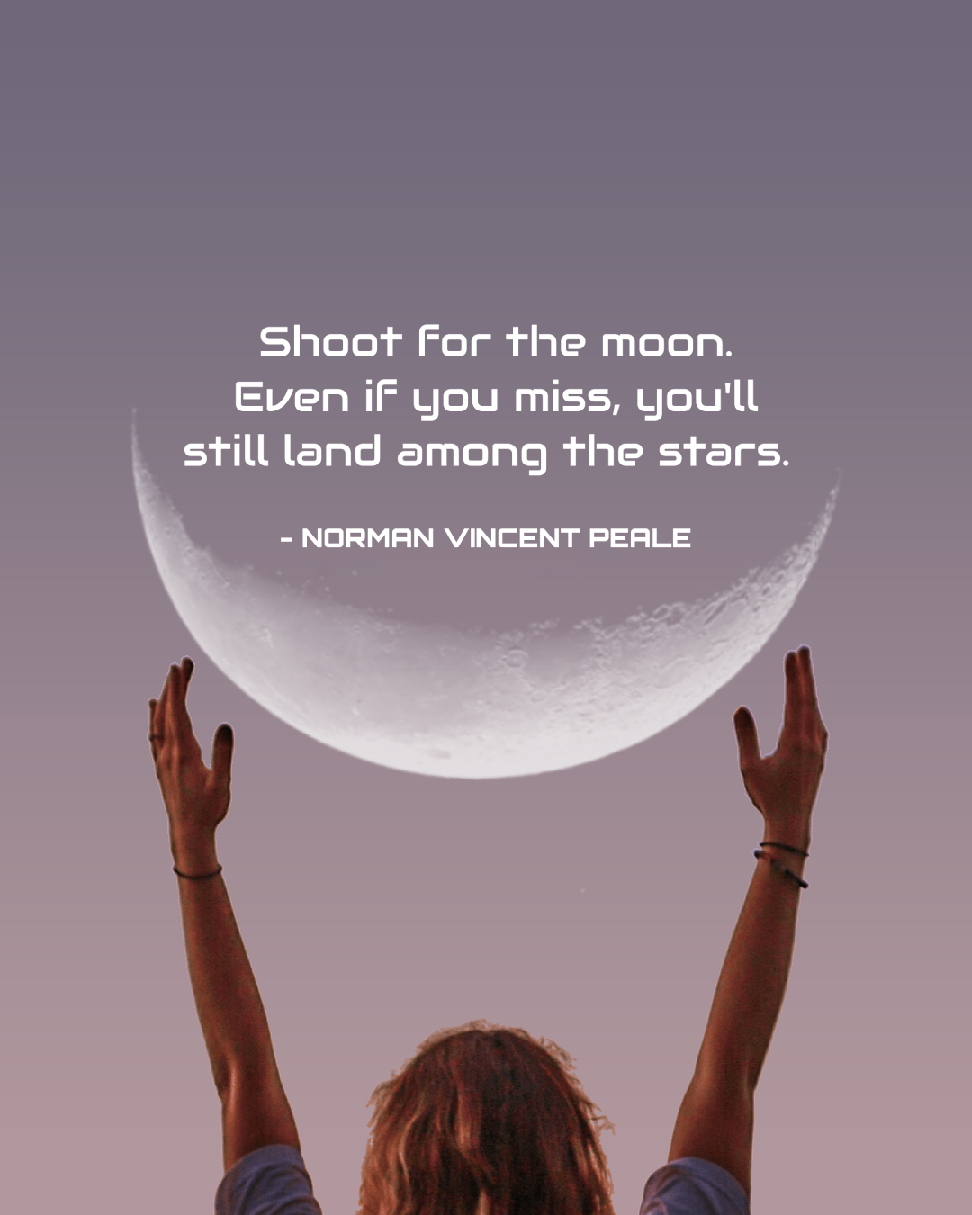
quote poster
The quote poster transforms a well-known motivational phrase into a visually uplifting composition. The image of raised hands reaching toward the moon reinforces the message of ambition and aspiration, while the soft, muted background creates a calm and inspirational tone. Clean, centered typography ensures readability and keeps the focus on the message itself. By pairing the quote with a symbolic visual, the design emphasizes the idea of striving beyond limits, encouraging viewers to pursue goals even in the face of uncertainty.
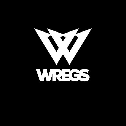
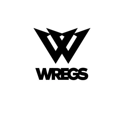
wregs logo
The WREGS logo is designed as a bold and instantly recognizable profile identity, built to stand out across platforms like Discord, YouTube, and social media. The sharp, geometric “W” mark creates a strong, aggressive presence, giving the logo a clean but powerful look even at small sizes. The high-contrast black and white color scheme ensures maximum visibility in profile icons, while the simplified form keeps it readable and memorable at a glance. Paired with a solid, modern wordmark, the design functions as a clean personal brand that feels both sleek and distinctive.
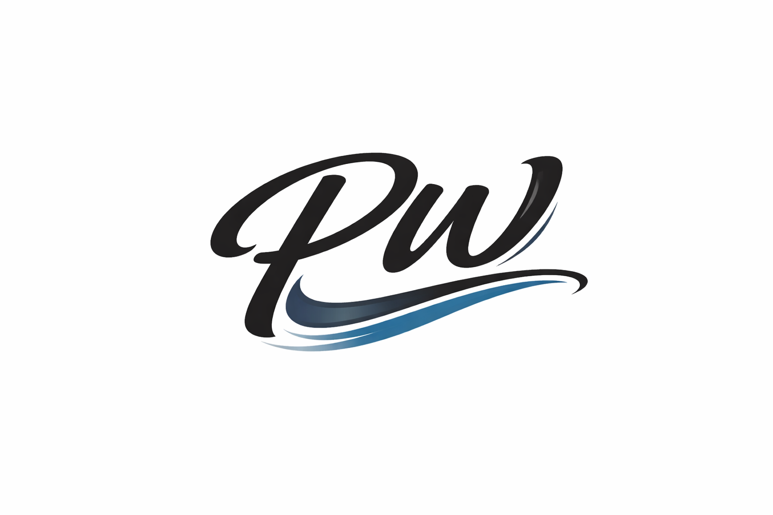
personal logo
This personal logo is designed to reflect a clean, modern identity through a stylized “PW” mark that feels both fluid and intentional. The script-style lettering gives the logo a sense of personality and individuality, while the smooth curves create a natural, confident flow. The addition of the blue wave element introduces motion and depth, symbolizing creativity and forward movement, while also adding contrast to the otherwise minimal black design. By combining expressive typography with a simple, versatile color palette, the logo functions as a strong personal brand that is both recognizable and adaptable across different platforms.
pittsburgh steelers intro animation
This animation is designed as a high-energy game intro for the Pittsburgh Steelers, built to amplify excitement as star players are introduced. The sequence uses a bold black and white visual style, allowing the iconic gold elements of the Steelers uniforms to stand out and command attention. A flashing Steelers logo anchors the animation, creating rhythm and intensity while reinforcing team identity. Quick cuts and dynamic motion highlight key players, giving each moment a cinematic feel that matches the atmosphere of a live stadium. The overall design captures the grit, tradition, and power of the Steelers, setting the tone for the game before it even begins.